This post is part of a 3 week series giving current and aspiring game devs the tools, resources, and advice they need to get started building for Windows. Check out the overview of the series to find what you need. For additional resources to build your app check out Appbuilder.
Polish is a big factor in making a mobile game that stands out. You can have a really nice game, but people aren’t playing it or don’t think that it is finished because it doesn’t “look” finished.
In this post, I’m talking to developers that are interested in doing a commercial game (or a free game that makes a little money with the general public) rather than those who are creating their game for purely artistic reasons. So if you are the sort of person that doesn’t want your vision compromised, ignore everything anyone says and go with your gut about how to do the art in your game. Also, this is going to be pretty basic. If you are a programmer that’s coded a basic game app, and you are looking for some considerations about icon and color selection, read on.
You’ve probably heard the term “programmer art” before, which is the sort of art made by someone who is better at coding than asset creation. I’m a little unusual in that I come from an art background and started doing coding later in life. This doesn’t mean that I’m a top-tier impeccably trained artist, just that I got a lot of art theory education that a lot of people who start out in code don’t often get. Most of this article is going to focus on color choices with a little information about icon design. There’s a lot more to graphic design than this, but I realized when I started writing that I don’t want to cram too much into one article. If there’s interest, I’ll talk about composition and other factors in a future post.
So let’s talk color. First of all: the most important rule. If you are using color, and only color, to represent something important in your game, add an alternative method. A significant portion of the population (mostly, but not always, men) is colorblind and can’t distinguish between, in the most common cases, red and green, or, sometimes blue and yellow. So if a big part of your game design requires that people distinguish between different colors to play, consider adding some other way to distinguish between the items.

Bejeweled (and lots of other Match Three games that are like it) uses different shapes of the gems to match as well as matching for the colors. Other PopCap games like Peggle have a “colorblind mode” that can be toggled to make some colors easier to distinguish. This is really important if you want your game to be accessible. So rule number one is, don’t just rely on color to communicate. Or, to put it a better way, don’t just rely on Hue.
Colors have lots of properties. In Photoshop, we can look at three main properties at once: Hue, Brightness, and Saturation. There are other color sliders, but we’ll stick with checking these. It’s really hard to define these with other terms but I’ll try. The Hue of a color is “what color is it?” It’s the property of light wavelength that distinguishes red from blue and so-on. (Hue is what colorblind people have a problem seeing, because of the cones in their eyes.)

Saturation and Brightness are easy to confuse. In this case, Saturation means how much of the hue is present in that color. A better way to understand it is that a color that isn’t very Saturated is gray. Brightness, meanwhile, relates to the color’s value, or how light or dark is the color? Is it closer to black or white?
Most phone games have bright colors. This helps the game to stand out and look cheerful, which is important. But not all bright colors are treated the same. It’s actually important to have a variety of Saturation and Brightness in your color selection so that the user’s eye is drawn to the most important things. Contrast is an important principle to make sure people understand the visual hierarchy of your game.
Let’s keep looking at Bejeweled. (This is Bejeweled Blitz, to be specific.) You’d probably say that this game uses really bright colors, and you’d be right; it also uses very saturated colors. Here I’ve picked out a few colors in the palette to show what I mean. You can see that the background colors are more muted, and have a low saturation; the blue I selected is really nearly gray. The jewels are the most important part of the game, so they have the highest brightness and saturation. The button is important, but not as important as the gems. It’s not quite as saturated as the gem that has the most similar (pink) hue, but it’s moreso than the background.

Click the picture to enlarge it and see the numerical values. Notice that I also pulled two different colors from the blue gem to show how even one object has a variety of colors, and how both saturation and brightness play a part in making the object stand out.
If all the parts of the game are saturated as much as the gems are, the background fights for the eye’s attention. Here’s a really dirty mockup showing what that would look like.

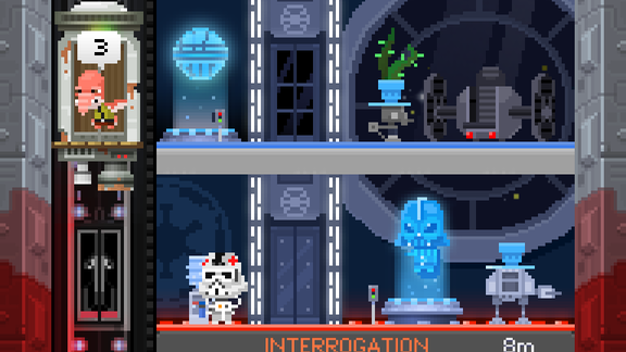
So you don’t want to go overboard with saturation and use it selectively. But you want to be sure to use some colors and not go overboard with low saturation, either. Here’s another game I’ve played a lot of, Tiny Death Star. It would be really tempting to make the entire interior of the Death Star mostly black and gray – it’s the Death Star! But gray is really boring to the eye. So notice that the Death Star interior is mostly blue. Even on the far right, where it looks like it’s gray, it’s actually a “cool gray” which is a gray with a little blue in it (saturation isn’t zero). The zero-saturation gray is reserved for the interface here (see the bottom) while the actual play area has some color to it and is a little more inviting.

Programmer art tends to be very representational as far as color selection: the sky is blue, the grass is green, and so-on. But consider mixing it up. If you look at artworks done by the pros they often change the colors of things depending on what the lighting situation in the world is. So don’t be afraid to get creative and add a little splash of color where there was none before, and consider the saturation and brightness of colors as well as the hue. You might like the results.
This post is getting long already but before I wrap I also want to talk about icon creation. This is most important for anyone who is trying to put their app into a store like the Windows Store or the App Store. There’s already been a lot of good articles about this topic, so I don’t want to rehash too much. Check out this article about the iOS store or this, loads of information about Windows store tiles and badges. Notice that the icons are specific to platform, so you want to consider the unique needs of your platform when porting a game.
I want to touch on the most important thing, which is to be sure that your icon or tile is strong and readable even at very small sizes. An icon that’s too busy and doesn’t give enough information at a glance is likely to be passed over by the eye. Standing out can be hard as it is, so don’t sell your chances short by trying to cram too much information onto a single icon. It might be tempting to try to put a lot of information on a livetile when you’re in Metro, but keeping it simple and structured seems to look the best. Color selection matters here too – you don’t want things to look too busy, or bland.
Thanks for reading and let me know if more posts like this are of interest. You can always contact me in comments or Twitter. Or, I’m going to have some Open Office Hours on Skype tomorrow where I’d be happy to answer questions. Just sign up for details.
Leave a Reply