This weekend my husband and I went for a drive in the Pennsylvania countryside.
It dawned on us that while we were puttering about, we weren’t too far from the town of Hershey, which is known of course for its chocolate. So we took a short detour to Hershey Chocolate World to shop. This is actually a fairly economic way to buy chocolate if you want that particular brand, since it’s sold in bulk quantities at the factory store. And I have a ridiculous fondness for baking even when I’m on a diet.
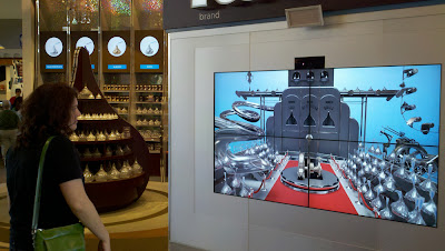
In the center of the store there is a cafe area. Just off to the side, where the large bins of Kisses are, is a relatively new interactive installation run on an XBox Kinect.
Here am I, with my purse slung a bit awkwardly over my shoulder, interacting with this installation. You can see the size and scope of it – a big screen with the Kinect positioned above. My hand is in a weird position because I’ve just finished “flinging” the kiss on the catapult in the screen, into one of the target holes on the display. This is the extent of the interaction – a user steps up, raises his or her arm, and “flings the Kiss,” choosing with body positioning which hole to toss the Kiss into.
People seemed to understand how to fling the Kisses. There didn’t seem to be any way to actually miss a throw; the display wanted the player to be victorious, and would slightly correct bad launches. In addition, there’s a default target right in the middle of the screen that requires literally no aiming on the part of the user.
But there is a problem with this game, and that’s its attract screen. It looks like this:
Throughout our evening we watched passers-by alternatively interact, and fail to interact, with this screen.
The trick is that this installation uses Kinect, which requires a user be standing back away from the screen. Those that looked down would see a dot on the floor, showing the right place to stand.
But more than one person didn’t see this. Instead, they did what seemed like the obvious thing: walked up to the screen, and put their hand directly over the palm shape, as if interacting with a touchscreen. Their hand was in the right position, but the Kinect couldn’t see them from that angle.
I’m saying “they” to be gender-neutral, but to be honest, we only saw young ladies confused by this interface. This may only be because our sample set was small, but boys and teenage boys seemed to have no problem at all with it. I watched a duo of teenage girls, both trying to put their hands on the screen, lowering them, and being increasingly perplexed by what they thought was an unresponsive touchscreen. After they stepped away, what appeared to be a six-year-old boy walked up, and, without any additional prompting, correctly stood on the dot and raised his hand to start the game. I’m not entirely sure what the difference here was. I might chalk it up to him being closer to the dot on the floor, thus seeing it right away, but, maybe it’s just that he was already familiar with the Kinect?
Seeing one girl repeatedly return to the palm print, obviously frustrated, I pointed out to her the dot on the floor and that she needed to stand back. I don’t think she wanted to take advice from a stranger, so she just looked embarrassed and walked away. Then I saw another pair of girls walk up to the game. But they didn’t experience the same confusion, immediately performing the correct gesture at the correct distance.
I was left wondering exactly how often, per day, people walk up to the display thinking it’s a touchscreen, and how many correctly notice the dot on the floor and realize they need to stand back (even if they don’t actually see the Kinect). I imagine, on some level, watching people repeatedly fail to initialize the game must be funny/frustrating for employees at the store.
There’s a quick hack that might fix this interface, but it would involve the designers of that interface noticing how people fail to interact with it. The palmprint shape, which is just about the right size to directly touch with a hand, is much too confusing. What the Kinect really wants to do is read the skeleton of the player, so what should be there instead is an image of a stick figure, with one hand raised up. An instruction on the screen that a player needs to stand back would also not be misplaced.


Leave a Reply